The Complete Guide to Design Tokens in 2024
By Alex Chen • Oct 12, 2024 • 8 min read
Design tokens are the atoms of modern UI. They bridge the gap between visual design and engineering, ensuring consistency across platforms and enabling the rapid iteration required in today's fast-paced product environments.
In 2024, design tokens have evolved from simple CSS variables to complex, version-controlled assets that power entire design systems. They allow teams to define a single source of truth for colors, typography, spacing, and motion, and propagate those values automatically to code, design tools, and documentation.
Whether you are just starting to explore tokens or looking to optimize your existing pipeline, this guide covers the best practices, tooling, and workflows that separate a static design system from a living, breathing product.
Types of Design Tokens
Design tokens are not limited to colors. A robust token system covers every aspect of the visual language. Here are the four primary categories you should define.
Color Tokens
The foundation of your system. Define semantic colors (primary, secondary, danger) alongside functional colors (background, text, border) and their variants (light, dark, disabled).
Typography Tokens
Mapping font families, font sizes, font weights, line heights, and letter spacing to a single set of values ensures that your hierarchy scales perfectly across all devices.
Spacing Tokens
Based on a scale (usually multiples of 4 or 8), spacing tokens provide the rhythm for layouts. They should be consistent with your grid system and padding rules.
Motion Tokens
Define easing functions, durations, and delays for animations. This creates a cohesive feel for micro-interactions, page transitions, and loading states.
Naming Conventions & Hierarchy
A chaotic naming convention is the fastest way to break a design system. The industry standard follows a hierarchical structure: Global → Alias → Component.
Global tokens are the raw values (e.g., `color-brand-primary-500`). Alias tokens provide semantic meaning (e.g., `color-text-heading`). Component tokens are specific instances (e.g., `color-button-primary-text`). This three-layer approach allows you to change a value at the global level and have it ripple through the entire system instantly.
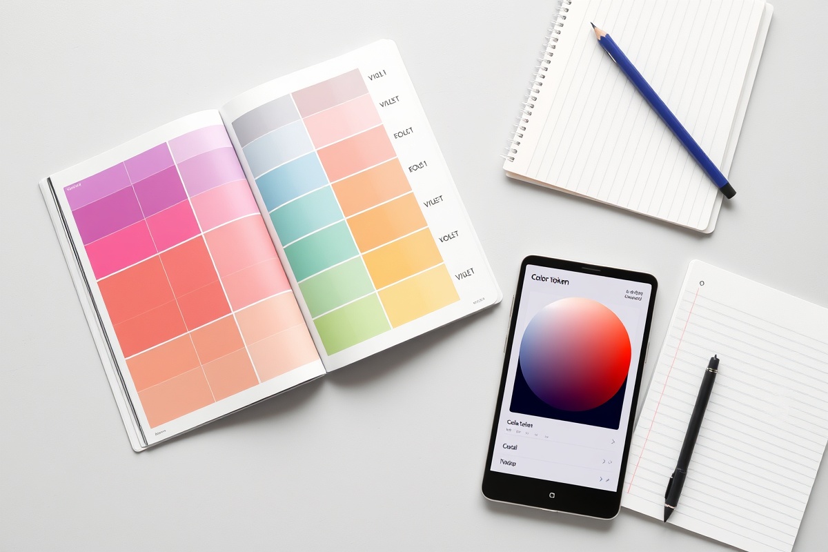
Using a tool like Modly helps visualize this hierarchy, ensuring that when you update a token, you can see exactly which components will be affected before you ship.
Tooling Comparison
Choosing the right tool for token management is critical for team velocity.
Style Dictionary
The open-source standard. Built by Amazon. Excellent for converting tokens into CSS, iOS, Android, and JSON. Highly flexible but requires significant configuration effort.
Theo
A lightweight, Node-based tool focused on design tokens. Great for simple projects, but lacks the advanced governance and documentation features of modern platforms.
Modly Token Manager
A purpose-built platform for design systems. Connects directly to Figma, provides visual diffs, auto-generates documentation, and manages versioning. Best for teams wanting to ship faster.
Multi-Theme & Dark Mode Strategies
Supporting multiple themes is no longer optional. The best strategy is to define your tokens in a way that separates values from names.
Instead of `color-primary-light` and `color-primary-dark`, use a theme object structure. For example, define a `light` theme with a `primary` value of `#7c3aed` and a `dark` theme with a `primary` value of `#9d5ff5`. This makes it trivial to add a high-contrast mode or a seasonal theme later.
Team Workflow for Incremental Adoption
Don't try to migrate your entire codebase overnight. Adopt tokens incrementally by starting with a "token-first" approach in your design tools and slowly rolling them out to new features.
1. Define tokens in Figma. Use the Modly plugin to map styles to tokens. 2. Generate code. Use the CLI to output the initial JSON files. 3. Refactor incrementally. Replace hardcoded values in new components with token references. 4. Document. Keep a living style guide that links back to the token definitions.
Token File Structure
Below is a JSON representation of a typical token file structure. Notice how semantic aliases are built upon raw values.
{
  "global": {
    "color": {
      "brand": {
        "primary": "#7c3aed",
        "secondary": "#c0376e"
      },
      "text": {
        "primary": "#ffffff",
        "secondary": "rgba(255,255,255,0.70)"
      }
    },
    "spacing": {
      "xs": "0.5rem",
      "sm": "1rem",
      "md": "1.5rem",
      "lg": "2rem"
    }
  },
  "alias": {
    "color": {
      "primary": "{global.color.brand.primary}",
      "text-body": "{global.color.text.secondary}"
    },
    "spacing": {
      "section-padding": "{global.spacing.lg}"
    }
  }
}
About the Author
Alex Chen
Alex is a Senior Product Designer with 10+ years of experience building design systems at scale. He currently leads the design infrastructure team at Modly, helping companies ship consistent UIs faster.
View all articles by Alex Chen →More like this, weekly
Join 2,400+ designers and developers building the future of UI.